Optimize Website for Mobile Devices
-
I opened the website on my Android phone (Google Chrome, Portrait Mode).
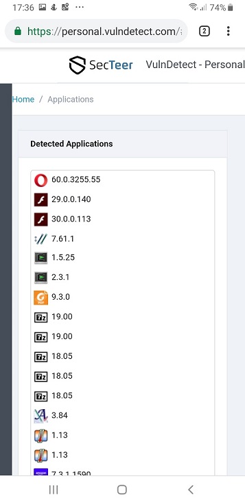
List of Apps
In the List of Apps I just see:
- the app icon
- the version number
So the following information is missing:
- the Application name
- the status information
- the hamburger menu (where I can switch to the configuration)
Here is a screen shot:

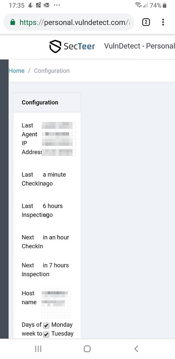
Configuration
In the Configuration only 40% of the available space is used.
So the text is not readable at all:
Suggestion
So you should optimize your website also for mobile devices.
Maybe you convert your website to a PWA (Progressive Web Application)?Details about PWAs you get here: https://en.wikipedia.org/wiki/Progressive_web_applications
Microsoft offers the PWA builder at https://www.pwabuilder.com/
There is also a GitHib site of the PWA builder: https://github.com/pwa-builder/PWABuilderMaybe you should consider this in the early stage of development.
-
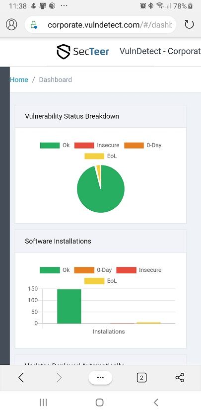
I tested the Business Version of VulnDetect on my phone.
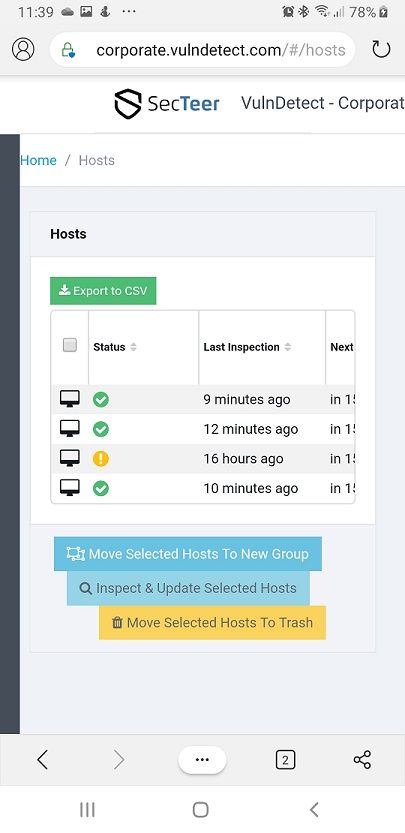
For admins it would be cool to perform some actions via their phones, so this is a valid scenario.Here some screen shots:

Here the menu on the left is not shown.
This element is very important to access all pages of the business version.Without the menu, the business version is not operabable.

Here the name of the host is not shown and also not the group.
-
T Tom referenced this topic on
Hello! It looks like you're interested in this conversation, but you don't have an account yet.
Getting fed up of having to scroll through the same posts each visit? When you register for an account, you'll always come back to exactly where you were before, and choose to be notified of new replies (either via email, or push notification). You'll also be able to save bookmarks and upvote posts to show your appreciation to other community members.
With your input, this post could be even better 💗
Register Login