Explain the Labels in the List of Applications
-
In the list of applications you show labels like "OK", "Insecure", "Untracked", "EoL" or "Unknown".
You also might show additional labels in the future.
When the user moves the mouse over the label then you show a tooltip.When the user expands an entry then you should explain all these labels.
Show each label in a separate line and show the tooltip text as normal text behind the label (show [Label] - Explanation)Some examples:
- [Green OK] - This version has no known vulnerabilities
- [Red Insecure] - This version has known vulnerabilities
- [Black Unknown] - The vulnerability status of this application is unknown
- [Blue Untracked] - The vendor does not supply reliable vulnerability information for this release of the application
- [Blue Prerelease] - This is a prerelease version of the the application
This way the user can read all texts without having to hover the mouse over the label and having to wait.
So this increases the usability. -
T Tom referenced this topic on
-
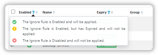
In the Ignore Rules you have a blue ? icon, when users click it, then you show a tooltip explainig the meaning of all icons:

Please add also such a blue ? icon in the column header Status in the List of Applications.
Hello! It looks like you're interested in this conversation, but you don't have an account yet.
Getting fed up of having to scroll through the same posts each visit? When you register for an account, you'll always come back to exactly where you were before, and choose to be notified of new replies (either via email, or push notification). You'll also be able to save bookmarks and upvote posts to show your appreciation to other community members.
With your input, this post could be even better 💗
Register Login