[Work in progress] Bundling Applications - Adjust UI
-
I tested the Bundling feature in the test system and in my opinion the UI really needs to be improved!
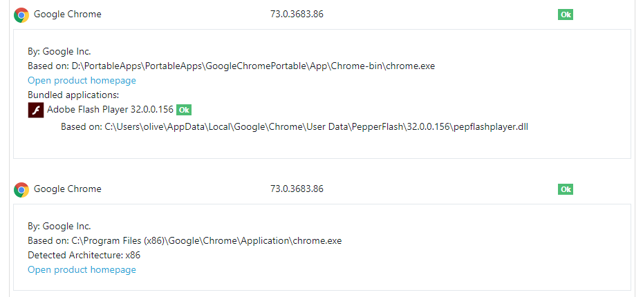
Here is a screen shot how Bundling currently looks:
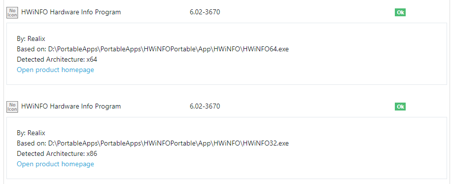
Here an other example that sows additional app-details:

I really don't like this layout, it is not clear and a bit confusing.
But I am here to give you some suggestions how this can be improved.
1) Remove the Detected Architecture and write the information behind the application in brackets.
So you will get for example:- HWiNFO Hardware Info Program (x64)
- HWiNFO Hardware Info Program (x86)
- Google Chrome (x86)
- Google Chrome
This saves you one line.
Same for the Detected Language: write the language in the bracket behind the application:
- Mozilla Firefox (DE, x64)
This saves you two lines.
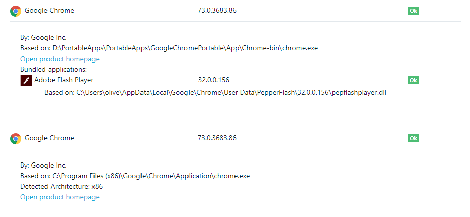
2) Align the version information of bundled apps.
You have a table where the installed version and the vulnerability status are in separate columns.
This looks very nice and clear.
For Bundled applications the installed version and the vulnerability status is not aligned, what looks awful.
So align them to the same grid like all other applications.This will look like this:

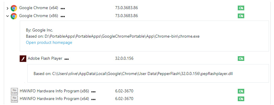
3) Separate folding for Bundles and App-Details
You should have two folding mechanism for Bundles and App-Details.
Add a > Icon in front of the name to expand the bundled apps (and a V to collapse them).
And add thee dots ... or an icon behind the application name to get the app details.When the app-details are expanded you should indent the box and align it with the name of the app.
This makes it more clear that they belong together.So users can expand bundled applications separate from the app-details.
And maybe you add an additional view where users see the Company and the path in the table (so expanding the app-details is no longer needed).Example for an expanded bundled Application:

Example for an expanded bundled Application with expanded app-details:

Example for an expanded bundled Application with expanded app-details and expanded details of the bundled app:

I hope that my suggestions help to improve the layout of the Bundled apps.
-
In Windows 10 I see in the Windows Task Manager the text (32-Bit) behind some processes.
So the user is used to this wording.Also websites use the text 32-Bit and 64-Bit when you download applications, like:
https://www.mozilla.org/de/firefox/all/
https://filezilla-project.org/download.php?type=clientSo you should add (32-Bit) and (64-Bit) instead of (x86) and (x64).
-
Please display the text "Bundled applications" in bold letters.
And you should add a little spacing (8 -12 pixels) between the text "Open product homepage" and "Bundled applications".
This will look like this:
-
The VulnDetect team is currently working on this feature, so please stay tuned...
-
Cool, this suggestion has been implemented:

You also found a better icon to indicate bundled apps.
Thank you very much.Now just two little changes should be implemented:
- Please display the text "Bundled applications" in bold letters.
- And you should add a little spacing (8 -12 pixels) between the text "Open product homepage" and "Bundled applications".
Then this feature is perfectly!
-
T Tom referenced this topic on
Hello! It looks like you're interested in this conversation, but you don't have an account yet.
Getting fed up of having to scroll through the same posts each visit? When you register for an account, you'll always come back to exactly where you were before, and choose to be notified of new replies (either via email, or push notification). You'll also be able to save bookmarks and upvote posts to show your appreciation to other community members.
With your input, this post could be even better 💗
Register Login