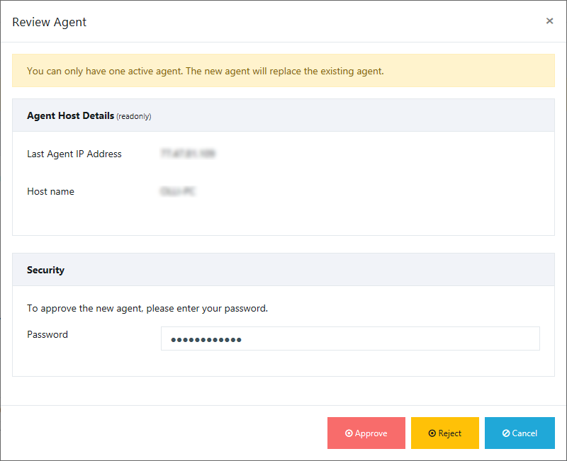
Button colors in the Review Agent window
-
In the "Review Agent window" the button colors and the icons on the buttons are not very user friendly.
Then also use colors in a unusual meaning.
The colour "red" is normally used for "warning" or "danger".
It should never be used for positive actions like "Approve".
So please use a green colour at the button "Approve" and a white checkmark icon on it.The button "Reject" should have a red colour and a white "x" on it.
The button "Cancel" can be blue but gray would be better, the icon on this button is OK.Please make sure that you use the same colors and the same buttons all over the web application.
This applies for example the buttons "Save", "Reset" and "Change Password" at the "Configuration" page . -
T Tom referenced this topic on
Hello! It looks like you're interested in this conversation, but you don't have an account yet.
Getting fed up of having to scroll through the same posts each visit? When you register for an account, you'll always come back to exactly where you were before, and choose to be notified of new replies (either via email, or push notification). You'll also be able to save bookmarks and upvote posts to show your appreciation to other community members.
With your input, this post could be even better 💗
Register Login