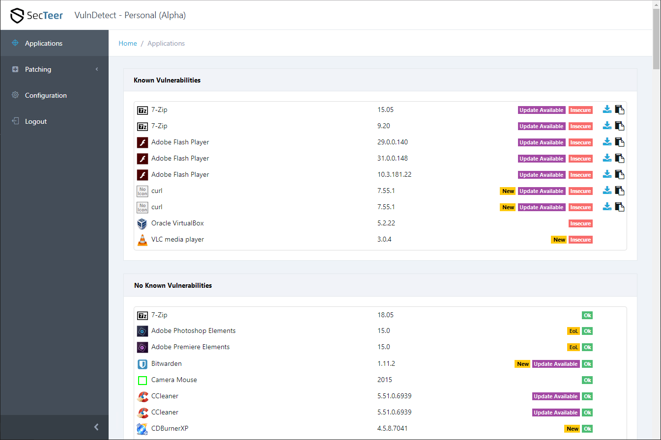
List of Applications - Improved UI
-
I work in a team that is responsible for Software-Ergonomics, Usability, and Accessibility.
Today I talked to a colleague of mine (a senior UX designer) about VulnDetect and we had some new ideas for a improved design for the List of Application.Here is a draft of the new design:

Click the image to enlarge itEach application has a specific purpose and the UI must support the user performing his work-task.
The main goal of VulnDetect is to tell the user wich applications have known vulnerabilities and if there are updates for these vulnerabilities available.To provide these information quickly and in a clear design, we split up the list of application is several groups:
- Known Vulnerabilities
- Unknown (not shown in the draft)
- No Known Vulnerabilities
This way users see at once the vulnerable apps (that require immediate action).
Applications that have no known vulnerabilities are in a separate list (no immediate actions required).At each application there should also be a label Update Available if there is an update available for this application.
See also Additional Status for Update Available.
So users see at once what patches must be installed ASAP.After performing a system scan, VulnDetect should mark all applications with the label "New" if:
- There is a new update available
- There is a new vulnerability detected for this app
- The application is new in the list of applications (then the label should be shown behind the application name)
- The user installed a new version of the application (then the label should be shown behind the version number)
See also Show Changes over time in the List of Apps.
The label "New" should have a yellow color, so for the label EoL you should select an other color.
You see that the new layout not only increases the usability and the user experience.
It also implements two other suggestions (see links above).I hope you all like the idea of the new UI and I hope it is implemented soon.
If you like the new UI, please upvote it. -
Maybe i am too technical orientated. I would prefer a sortable table (stable sort, so no quicksort).
Add a column with the possible values:
1- Known Vulnerabilities
2 - Unknown
3 - No Known Vulnerabilities -
We are open for ideas, so feel free to discuss.
I don't know when we will work on this part of the UI, but at some point it will get a major revamp.
-
I think both ideas should be combined!
So I have column headers that allow me to sort the table by any column.
And in the table I see groups for each criteria in the sorted column:- By default the list is sorted by status (Insecure, Unknown, OK) and VulnDetect shows for each status a separate group.
- When I sort by the column "Update" then there are groups "Update Available" and "Up-to-date"
- When I sort by company, then there is a group for each company
- When I sort by name, then there will be no groups shown.
This way we have groups (better UI, more user friendly) and allow sorting.
-
Really an awesome concept!
-
@OLLI_S
I like this design, which separates the Vulnerable softwares. Also anyway it can be non-browser based, like Secunia PSI, PatchmyPC, Sumo, Heimdal Pro etc. which are Installed and run when you start the PC? I always launch browsers in incognito mode and don't store any logins in browsers. For Vulndetect, i have to login every time if i want to look at the Applications dashboard. -
I have an enhancement of this suggestion:
- the label Untracked means, that there is no vulnerability-information available, so you might change the background colour to light-grey (#BCC5D0) and the text colour to black
- the label Prerelease should be textual changed to Pre-Release, the colours can remain like they are.
Maybe this makes Untracked and Prerelease differentiable with their colours.
-
@OLLI_S Some of the suggestions are now live and Personal is now 1.0, thus, no longer beta.
I've checked the spelling of Prerelease, and Prerelease is an official word, without the -, so we kept it as is.
-
T Tom referenced this topic on
-
 O OLLI_S referenced this topic on
Hello! It looks like you're interested in this conversation, but you don't have an account yet.
Getting fed up of having to scroll through the same posts each visit? When you register for an account, you'll always come back to exactly where you were before, and choose to be notified of new replies (either via email, or push notification). You'll also be able to save bookmarks and upvote posts to show your appreciation to other community members.
With your input, this post could be even better 💗
Register Login